Time to Revamp Your Website? 12 Outdated Web Features That Need to Disappear
I'm a huge believer in form following function. It's important to remember that what looks cool to you might not be the same as what works the best for your user. No matter how aesthetically pleasing a website's design may be, users become frustrated and leave when it's not simple for them to find what they want. This is also true if they have too many obstacles to content, including over using pop ups and even slow load times.
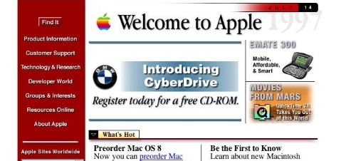
While I'm sure your website is more current than the above screen shot of Apple's homepage circa 1997, this Mashable article by Scott Gerber is absolutely worth a read; 12 Outdated Web Features That Need to Disappear in 2014.

